Column Customization
The example below shows a sample of the IQdesktop column headers. The document grid columns may be customized to better meet your needs. Columns can be moved, removed, added, widened or narrowed.
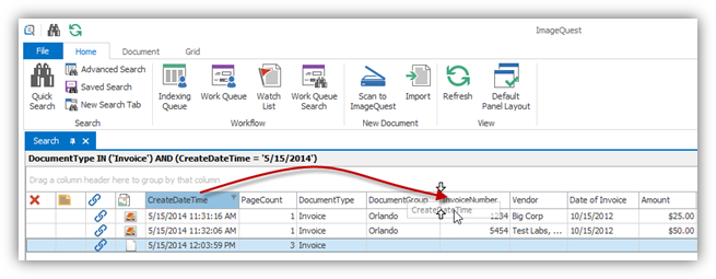
To move a column header, left-click on the column, drag and release it in the header row where the column is desired. For example, CreateDateTime, as shown below, is being moved from its default location to the right, in between DocumentGroup and InvoiceNumber.
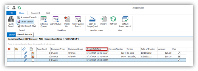
The end result is as follows:
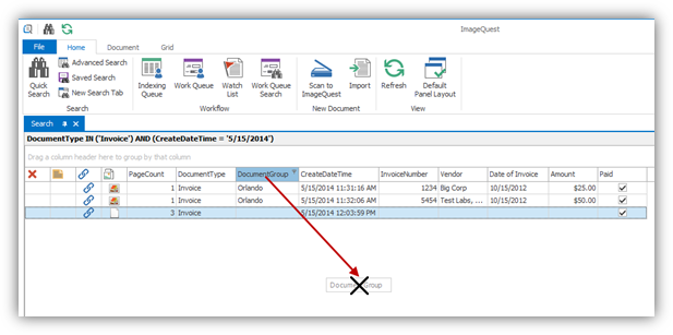
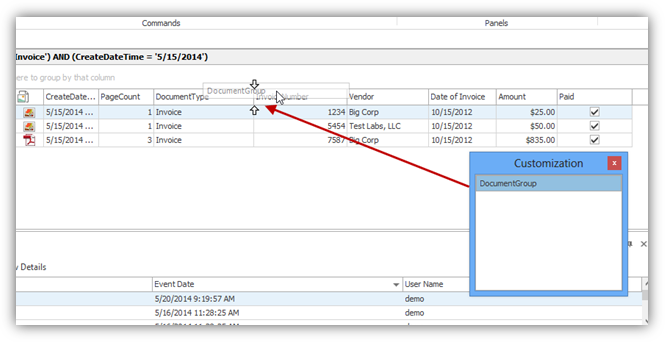
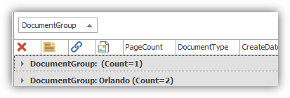
A user can remove a column by left-clicking on the column header to be removed and holding down the left-button to drag the column out of its initial setting as modeled below. An X will appear in place of the normal mouse cursor. For example, the column, “DocumentGroup”, is being removed from the header.
Release the left button to remove the column. The column name is deposited in the “Customize Columns” window, which stores columns that are hidden from the user.
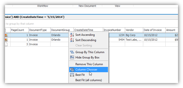
To add a column back to the header, right-click on the header row and select Column Chooser from the menu as displayed below.
The “Customization” window will open. As demonstrated below, drag the column name from the Customization window back to the header row by right-clicking on it, dragging it and releasing it. In the example on the following page, the column, “DocumentGroup”, is returned to the header.
Columns can also be narrowed or widened
depending on how much column space you require for any column
displayed as demonstrated below. To narrow or widen a column,
position the mouse across the line dividing the two columns until
you see and left-click and
drag, moving to the left to narrow or to the right to widen the
column; the CreateDateTime column is being narrowed in the example
below.
and left-click and
drag, moving to the left to narrow or to the right to widen the
column; the CreateDateTime column is being narrowed in the example
below.
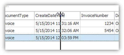
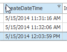
Here is the CreateDateTime column narrowed:
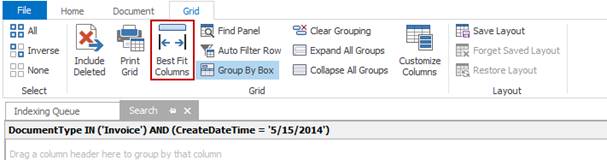
Best Fit
The Best Fit feature automatically
sizes a column to fit the maximum length of data in the column at
the time of sizing. To expand a specific column like
CreateDateTime to the best fit for viewing, double click between
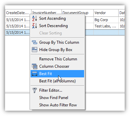
the column headings or right-click on the header row and select
Best Fit as displayed below. To expand all the columns at once, select
Best Fit (all columns) from the right-click
header. 
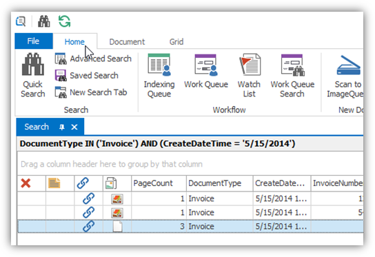
You may also access this feature in the Grid ribbon as shown below.
Sorting
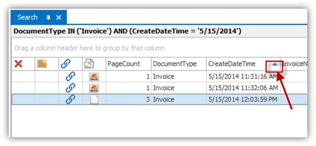
Sorting can be performed on any displayed column in ascending or descending order. There are two ways to define the sort option: 1) click on the header as targeted below to display the results in ascending or descending order; 2) right-click on the column header of the column to open the header menu and select “Sort Ascending” or “Sort Descending”. The data in the grid will then be sorted accordingly once you click it. To clear any sorting selection, right-click on the column header and select Clear Sorting.
Note: Multiple columns may be sorted by holding the shift key down while clicking additional column headers, one at a time.
Grouping
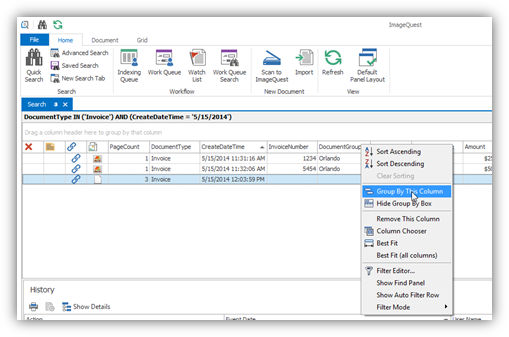
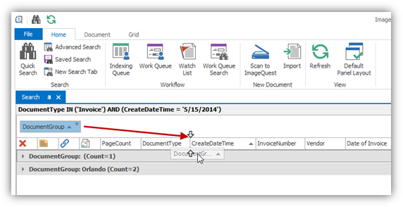
IQdesktop allows for the grouping of one or more columns which allows for a different view of the grid. It also shows a row count associated with each attribute value. There are two ways to group columns: 1) right-click on the column header intended for grouping; this will open the header menu as displayed below. Select Group By This Column which moves the column to the Group By Box above; or, 2) click and drag a column header to the Group By Box. Repeat either grouping method as needed to group by multiple columns.
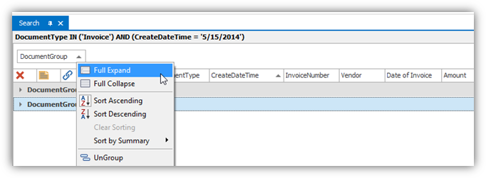
To ungroup a column, right-click on the column in the Group By Box and select the Ungroup option, or click and drag the column back to the column header as demonstrated here.
The grid may be fully expanded or fully collapsed using the Expand All Groups and Collapse All Groups buttons on the Grid ribbon or by right-clicking anywhere in the Group By Box and selecting the appropriate menu item, as seen on the following page.
Note: To clear the contents of the Group By Box, click Clear Grouping on the Grid ribbon tab or right-click anywhere in the box and select Clear Grouping.
Filters
Filters limit the returned search results and help customize a view to easily locate data. One or more filters can be applied to columns currently displayed in the document grid.
To apply a filter to a column, left-click on the drop-down menu arrow on the right-hand side of a column header. As shown below, the drop-down menu will list all of the values currently displayed in the column for convenient selection as a filter. Once a value is selected, the drop-down menu will close and the display grid will show the rows of data that matched the selected value.
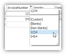
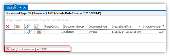
The bottom of the grid now displays the
applied filter, ‘1234’ to the column, “InvoiceNumber”, as shown on
the previous page. To cancel the filter, simply click on the
 to the left of the
filter.
to the left of the
filter.
Note: Multiple filters may be applied to more than one column at a time.
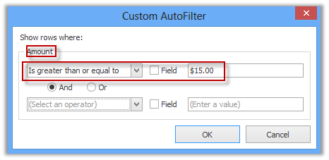
More complex or versatile filters may be
created by selecting the “Custom” option from the drop-down
list. The “Custom” option allows the user to create
conditions bound by an “And/Or” clause. When “Custom” is
selected, the “Custom AutoFilter” window appears as highlighted
below. For example, the user selects “is greater than or
equal to” and enters a value of $15.00 to locate documents that
contain Amounts equal to or greater than $15.00. There are several
criteria that can be utilized, which are listed in the drop-down
menu (i.e. “equals,” “does not equal,” “is greater than,”
etc.). Click “OK” to apply the filter.
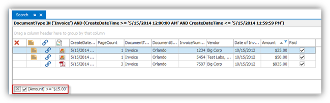
Here are the results of the custom AutoFilter:
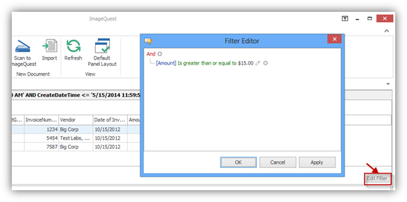
The “Edit Filter” button can be clicked to edit the current filter as shown below. A filter editor dialog box appears where the user can edit the filter as desired.
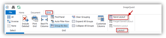
Save Layout
Once the grid has been customized to your
liking (i.e. column sort order, column removal, column order), you
have the option to save the grid layout. To save the grid
layout, press Ctrl+L or go to the Grid ribbon tab as
demonstrated below and click on the “Save Layout” button
 ; the options to Restore and
Forget Saved Layout are not available if there is no saved
layout. Once a layout has been saved, you may select
Forget Saved Layout to delete it and restore the default
look.
; the options to Restore and
Forget Saved Layout are not available if there is no saved
layout. Once a layout has been saved, you may select
Forget Saved Layout to delete it and restore the default
look.
If you have a saved layout and make changes to the grid during your session, you may select Restore Layout to revert back to the saved grid layout.
Note: The “Indexing Queue” grid layout is saved automatically every time the user exits the queue.